In this analysis of NYC parking and speed camera violations, we address three key questions relevant to a law firm interested in helping drivers contest tickets:
Do certain agencies issue higher payment amounts?
Do drivers from different states (NY, NJ, CT) pay more?
Do certain counties tend to have higher payment amounts?
This chapter uses API-based data collection, data cleaning and recoding, exploratory visualization, descriptive statistics, and one-way ANOVA to compare payment amounts across groups.
Note
This chapter pulls data directly from NYC Open Data via API. Because this is a live dataset, results may change slightly over time as new violations are recorded.
Dataset: NYC Parking Camera Violations (NYC Open Data)
https://data.cityofnewyork.us/resource/nc67-uf89.json
library(tidyverse)
Warning: package 'ggplot2' was built under R version 4.4.2
Warning: package 'stringr' was built under R version 4.4.3
Warning: package 'forcats' was built under R version 4.4.2
Warning: package 'lubridate' was built under R version 4.4.2
── Attaching core tidyverse packages ──────────────────────── tidyverse 2.0.0 ──
✔ dplyr     1.1.4     ✔ readr     2.1.5
✔ forcats   1.0.0     ✔ stringr   1.6.0
✔ ggplot2   4.0.0     ✔ tibble    3.2.1
✔ lubridate 1.9.4     ✔ tidyr     1.3.1
✔ purrr     1.0.2
── Conflicts ────────────────────────────────────────── tidyverse_conflicts() ──
✖ dplyr::filter() masks stats::filter()
✖ dplyr::lag()    masks stats::lag()
ℹ Use the conflicted package (<http://conflicted.r-lib.org/>) to force all conflicts to become errors
library(httr)library(jsonlite)
Attaching package: 'jsonlite'

The following object is masked from 'package:purrr':

    flatten
library(mosaic)
Registered S3 method overwritten by 'mosaic':
  method                           from
  fortify.SpatialPolygonsDataFrame ggplot2

The 'mosaic' package masks several functions from core packages in order to add
additional features.  The original behavior of these functions should not be affected by this.

Attaching package: 'mosaic'

The following object is masked from 'package:Matrix':

    mean

The following objects are masked from 'package:dplyr':

    count, do, tally

The following object is masked from 'package:purrr':

    cross

The following object is masked from 'package:ggplot2':

    stat

The following objects are masked from 'package:stats':

    binom.test, cor, cor.test, cov, fivenum, IQR, median, prop.test,
    quantile, sd, t.test, var

The following objects are masked from 'package:base':

    max, mean, min, prod, range, sample, sum
library(knitr)
Warning: package 'knitr' was built under R version 4.4.3
library(kableExtra)
Warning: package 'kableExtra' was built under R version 4.4.2
Attaching package: 'kableExtra'

The following object is masked from 'package:dplyr':

    group_rows
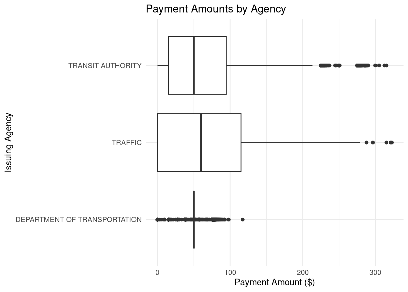
Figure 4.1: Boxplots of payment amounts by issuing agency for NYC parking/speed camera violations.
Agencies like Parks, Sanitation, and Business Services show smaller distributions, indicating that the payments they issue are generally lower and less variable. Traffic agencies, the Housing Authority, and the Police Department show higher typical payments and more extreme high outliers (over $300), indicating high-cost violations.
Table 4.1: Descriptive statistics for payment amounts by issuing agency.
agency
min
Q1
median
Q3
max
mean
sd
n
missing
TRANSIT AUTHORITY
0
15.08
50
94.6775
315.15
73.63017
70.03765
18668
0
TRAFFIC
0
0.00
60
115.0000
322.51
57.34548
58.01245
61356
0
DEPARTMENT OF TRANSPORTATION
0
50.00
50
50.0000
117.29
47.40950
24.05688
18047
0
Several agencies appear to have set fees with little variance. Police and Fire fall in the mid-range, while Traffic shows some of the largest maximum payment amounts.
4.2 1.3 One-way ANOVA
agency_model <-aov(payment_amount ~ agency, data = camera_agency)summary(agency_model)
               Df    Sum Sq Mean Sq F value Pr(>F)
agency          2   6573726 3286863    1045 <2e-16 ***
Residuals   98068 308497374    3146
---
Signif. codes:  0 '***' 0.001 '**' 0.01 '*' 0.05 '.' 0.1 ' ' 1
The ANOVA output indicates a statistically significant effect of issuing agency on payment amount (p < .001), meaning average payment amounts differ across agencies.
4.3 2. Do drivers from different states (NY, NJ, CT) pay more?
camera_states <- camera %>%filter( plate_state %in%c("NY", "NJ", "CT"),!is.na(payment_amount) )
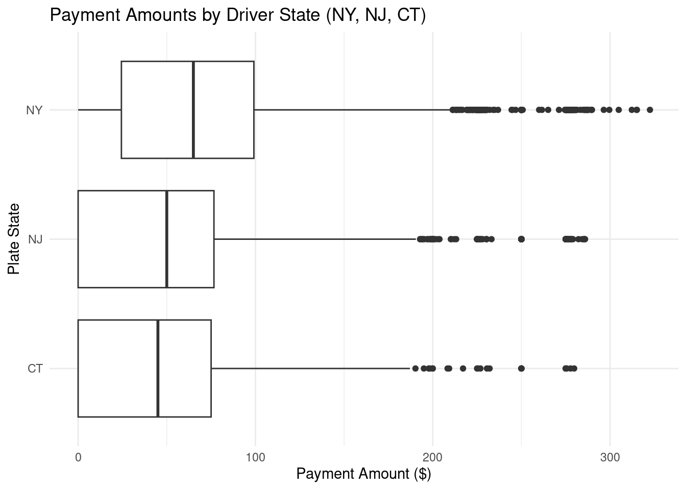
ggplot(camera_states, aes(x = plate_state, y = payment_amount)) +geom_boxplot() +coord_flip() +theme_minimal() +labs(title ="Payment Amounts by Driver State (NY, NJ, CT)",x ="Plate State",y ="Payment Amount ($)" )
Figure 4.2: Boxplots of payment amounts by driver state (NY, NJ, CT).
Although median payments are similar across the three states, New York shows more extreme high payment outliers. Connecticut appears to have lower overall payment amounts, with New Jersey in between.
PRE values help interpret practical importance: even statistically significant differences can explain only a small share of overall variability.
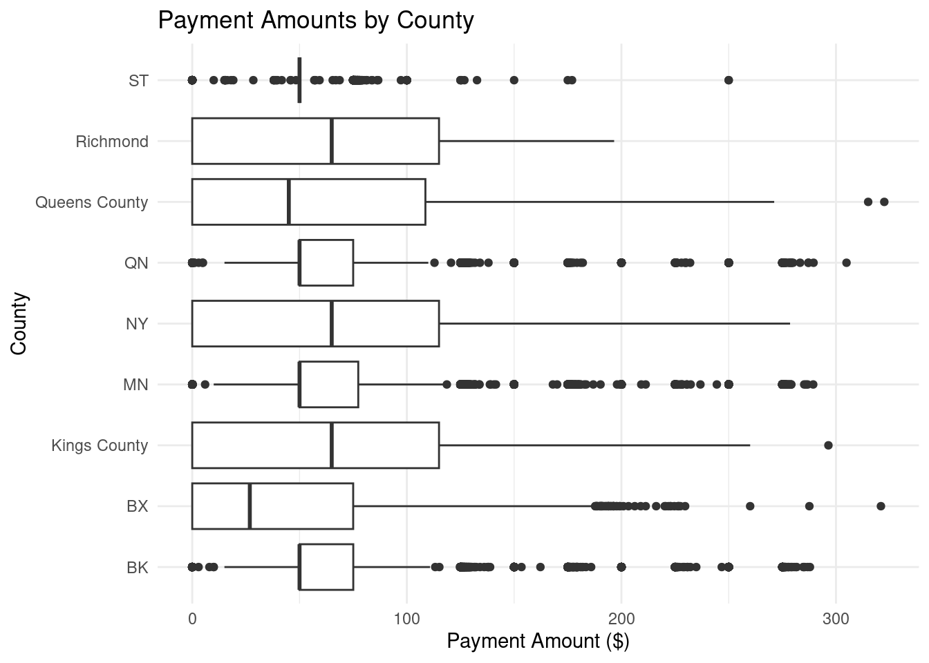
4.4 3. Do certain counties tend to have higher payment amounts?
camera_county <- camera %>%filter(!is.na(payment_amount), !is.na(county))
ggplot(camera_county, aes(x = county, y = payment_amount)) +geom_boxplot() +coord_flip() +theme_minimal() +labs(title ="Payment Amounts by County",x ="County",y ="Payment Amount ($)" )
Figure 4.3: Boxplots of payment amounts by county.
Most counties have medians between about $50–$100, but outliers are high across the board. Differences between counties appear modest compared to the overall spread.
mosaic::favstats(payment_amount ~ county, data = camera_county) %>%arrange(desc(mean)) %>% knitr::kable() %>% kableExtra::kable_styling(full_width =FALSE)
Table 4.3: Descriptive statistics for payment amounts by county.
county
min
Q1
median
Q3
max
mean
sd
n
missing
MN
0
50
50.00
77.365
289.38
74.19978
69.36448
5800
0
Richmond
0
0
65.00
115.000
196.61
60.83229
54.46480
1211
0
Kings County
0
0
65.00
115.000
296.47
60.37260
57.79348
15318
0
NY
0
0
65.00
115.000
278.60
59.75987
57.75214
22787
0
BK
0
50
50.00
75.040
287.85
58.77253
50.06585
10563
0
Queens County
0
0
45.00
108.660
322.51
57.55412
57.13602
13880
0
QN
0
50
50.00
75.000
304.90
54.90047
39.47321
8926
0
ST
0
50
50.00
50.000
250.00
50.77564
23.46841
1885
0
BX
0
0
26.83
75.000
320.94
44.19731
52.81800
10993
0
Overall, payment amounts are similar across counties, with Manhattan showing slightly higher typical payments and high-value outliers.
4.4.1 One-way ANOVA
county_model <-aov(payment_amount ~ county, data = camera_county)summary(county_model)
               Df    Sum Sq Mean Sq F value Pr(>F)
county          8   3972906  496613   164.4 <2e-16 ***
Residuals   91354 276041085    3022
---
Signif. codes:  0 '***' 0.001 '**' 0.01 '*' 0.05 '.' 0.1 ' ' 1
Based on these results, the law firm should prioritize outreach to New York drivers and to violations issued by higher-cost agencies (especially Traffic and Police-related agencies), since these show higher typical payments and more extreme outliers. County differences are statistically detectable but appear modest in practical terms compared to the overall variation in payment amounts.